


 |
Austen art in issues #2 and 3 of |
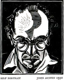 John Austen was born in Kent, England in 1886. That's the same year
as Kay Nielsen, and both
share a fascination with a style of art made most popular by Aubrey
Beardsley (1872-1898). As Impressionism and Art Nouveau were confronting
and confusing the public, the "decadent" style of Beardsley
was finding its own audience. Harry
Clarke, Nielsen, Alastair, and others were enamored with the
strength of line and form and startling, solid blacks.
It wasn't until 1906 when Austen came to London, as a carpenter,
that he was first exposed to Beardsley's work. The effect it had
on him was said to be overwhelming and he began to study art -
and Beardsley in particular. It wasn't until 1921 that he had
his first illustrations published. The book was The Little
Ape and despite being an obvious paean to his hero, the illustrations
contain a seed of uniqueness that kept them being slavish copies.
 My favorite book
from this period is his 1922 Hamlet. This project won him
recognition and fame and signals the end of his total reliance
on the decadent style. While there is much to recommend this to
appreciators of Beardsley and Clarke, there are also obvious indications
of a new, more linear direction to his art. To simply dismiss
this as the work of a stylistic copyist is an indication that
a critic has only glimpsed the surface of the work - and then
only seen a few of the major plates.
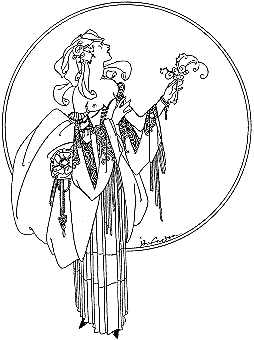
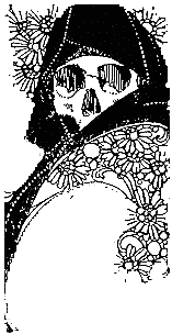
For every texture-rich death image like the one at right, there
is an elegant fine-line drawing as at left. It's a very eclectic
combination of styles, but there is a consistency of artistic
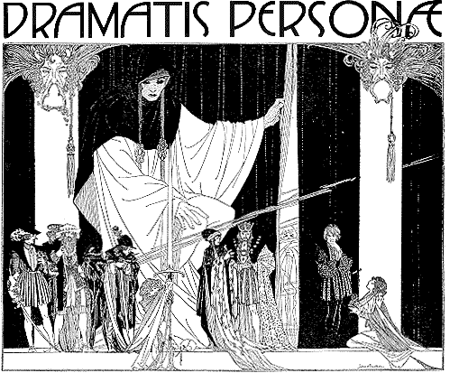
development often missed on first glance. Even the more complex
compositions (as below) seem very derivative until really examined
carefully. Then Austen's underlying approach is seen as obviously
more curvilinear and subtle than his influences. His subsequent
career would only emphasize those differences.
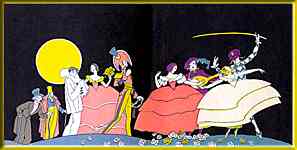
Images from some of his following books show this clearly. The next year he illustrated, among others, The Adventures of Harlequin with a combination of flat color and fine line. Below are the endpapers. 1923 also saw his illustrations for Perfection, with a creative use of gilt throughout.
Two samples from other contemporary books emphasize the new directions he was exploring.
|
|
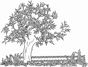
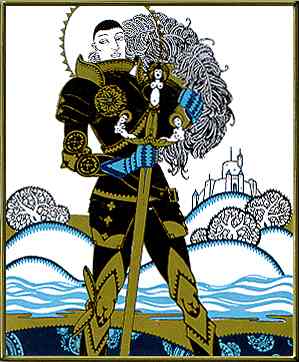
| The Five Black Cousins - 1924 | Everyman & Other Plays - 1925 |
Both show his lingering fascination with patterns, but it's in the context of simpler designs and used as a tone or a texture rather than as a graphic design motif for the entire image. The Everyman images are some of the earliest color explorations I've seen by him and his use of the blue is more experimental than the gilt. The gilt fills space while the blue helps define it or emphasizes its boundaries.
He was part of an exhibition in 1925 with Harry Clarke and Alan Odle.
 Throughout
the '20s he illustrated dozens of books, continually refining
and simplifying his style while practicing to be, as Dorothy Richardson
says in her essential, John Austen and the Inseparables,
"...the perfect aesthete, precious, even in appearance,
to the finger-tips; and a trifle cynical." The self-portrait
in woodcut above is taken from that book.
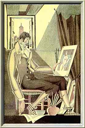
In 1927, he illustrated The Gods are Athirst, one of the Dodd-Mead series of Anatole France reprints, best typified by the volumes by Frank Papé. The sample image at right shows that he certainly had the manner of the "aesthete" captured perfectly. Love the slippers.
 By
1930, he'd abandoned the pretenses of the London "artiste"
and was back in Kent. The style he had settled into was similar
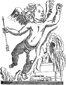
to the fine-line and cross-hatch texturing of the cherub at left
from The Guardsman and Cupid's Daughter (1930). Much of
the decade of the '30s was devoted to books for the Heritage Press
or the Illustrated Editions Club.
Some of the titles: Vanity Fair, Pickwick Papers, David Copperfield, Oliver Wakefield, and A Comedy of Errors.
He wrote a book titled The ABC of Pen and Ink Rendering
in 1937. He illustrated Jane Austen's Persuasion in 1944. He
died in 1948.
 To learn more about John Austen, see:
| John Austen and the Inseparables | Dorothy Richardson, William Jackson Ltd. 1930 |
| The Dictionary of 20th Century British Book Illustrators | Alan Horne, Antique Collectors' Club, 1994 |
| The Vadeboncoeur Collection of ImageS B&W 2,3 | Jim Vadeboncoeur, Jr., JVJ Publishing, 2004, 2006 |
|
Illustrations are copyright by their respective owners. This page written, designed & © 1999 by Jim Vadeboncoeur, Jr. Updated 2012. |
